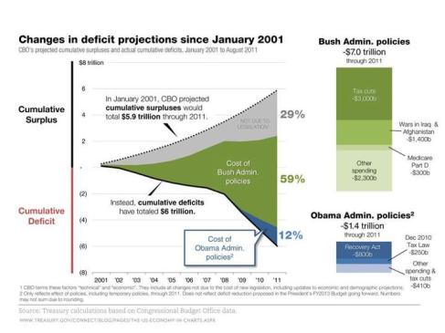
Below is a fascinating chart that comes right from the US Treasury. Below we can see the changes in deficit projections since January 2001. Prior to the Bush Administrations policies (including war in Iraq and Afghanistan) the US was projected to be on it’s way to a healthy budget surplus. The change from this projection to the current situation, as seen below, is dramatically different.
-
Recent Posts
Archives
Categories
- All about Gold as US doubts European bailout
- Australian Economy
- Australian property bubble or not?
- Bing and Yahoo
- BP's shares only this low twice in a decade
- Chances of Euro collapse
- China slowdown and contagion
- China's property bubble
- Currencies march against the euro
- David Jones and the Reject Shop
- Debt and deficit in Europe
- Dow drops over 9% in 45 minutes
- EUR falls to new low against USD
- Europe debt problems
- europe debt summed up
- Europe's web of debt
- european contagion
- European debt 2000 vs 2009
- Facebook and Twitter growth
- Four big bad bears
- Global economic recovery
- Goldman Sachs ABACUS 2007 AC-1
- Greece may sue US banks
- Henry tax review
- How the smartphone market works
- How to lose a trillion dollars in 10 days
- India for the future
- interest rates
- Ireland and Portugal's debt problems
- Iron Ore
- Is Huffpo really about the break a media ceiling?
- Is the future Android?
- LIBOR"s steep rise
- Macrobusiness
- Online spending growth
- RBA
- RSPT visualised
- Selling Australia
- smartphone industry growth iphone and android compared
- Smartphones market share Q1 2009 – 2010
- Spanish debt
- Texas and taxes
- The biggest loser(s)
- The Euro vs the world
- The number one barrier to buying online
- The who's who of online video
- Trillion dollar Euro bailout
- Uncategorized
Meta

